|
Director's
Commentary
I've
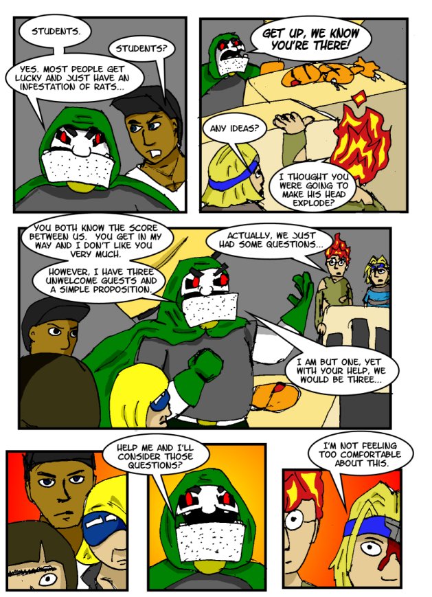
been thinking that Dr. Doomday has an exceptionally boring Tee-Shirt
on. He used to wear a grey one like that, but with "Genius
At Work" written on it, but I found that a bit distracting
a lot of the time. In fairness though, I suppose he wears a green
cape, which is less run of the mill.
I know
I've mentioned this before, but I've been reading a few "webcomic
advice" forums lately and realise that I've made a lot of
the mistakes listed in these in the past, and that I'm probably
making a lot of the mistakes still (I'm guilty of using gradient
fills quite a bit..). It's like a lot of things in life though,
until you make the mistake and recognise it as a mistake, you're
not going to understand why you shouldn't do it. I can see what
has and hasn't worked in my webcomic past, and I will look back
on my current work in the weeks to come and surely learn from
what I've done wrong there too.
If
anyone is out there in the same boat as me, don't be afraid to
get busy making mistakes.
|